Java Swing Graph

Software – Eclipse, Java, Swing, Graphics2D
Knowledge – Simpsons Rule
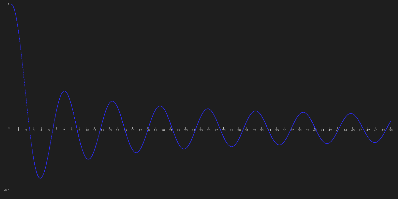
I used Java’s Swing framework to generate a visual representation of an integration function in graph form. I implemented the integration by designing an algorithm that applied Simpson’s Rule to the original function. Graphing the integrated function for a domain of 0 to 50, generating a point for each .01 change in x.
Dijkstra's Algorithm Visualization

Software - HTML5 Canvas, JavaScript
Knowledge – Dijkstra’s Algorithm, Animating HTML5 canvas using JS
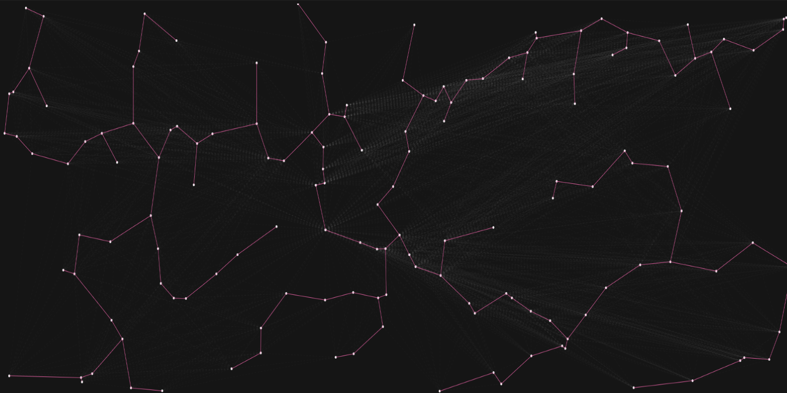
When I first started making the site, I felt my homepage was lacking something and while researching web design I found an article on particle effects and I was particularly fond of effects that would dynamically link points together based on proximity. It would be against everything I learned to inefficiently just match the two closest points having recently finished a course in algorithms, I decided to take it a step further and incorporate one of the shortest path algorithms into my animation, choosing Dijkstra’s algorithm. The edges between points were based on distance on-screen and calculated using the distance formula. Paths that were removed in favor of shorter path’s between nodes were still drawn in gray to visibly show a remnant of the algorithm’s trace. To make the animation more dynamic I adjusted edge thickness based on length in comparison to the maximum distance possible.
Kruskal Visualization

Software – HTML5 Canvas, JavaScript
Knowledge – Kruskal’s algorithm, Heapsort
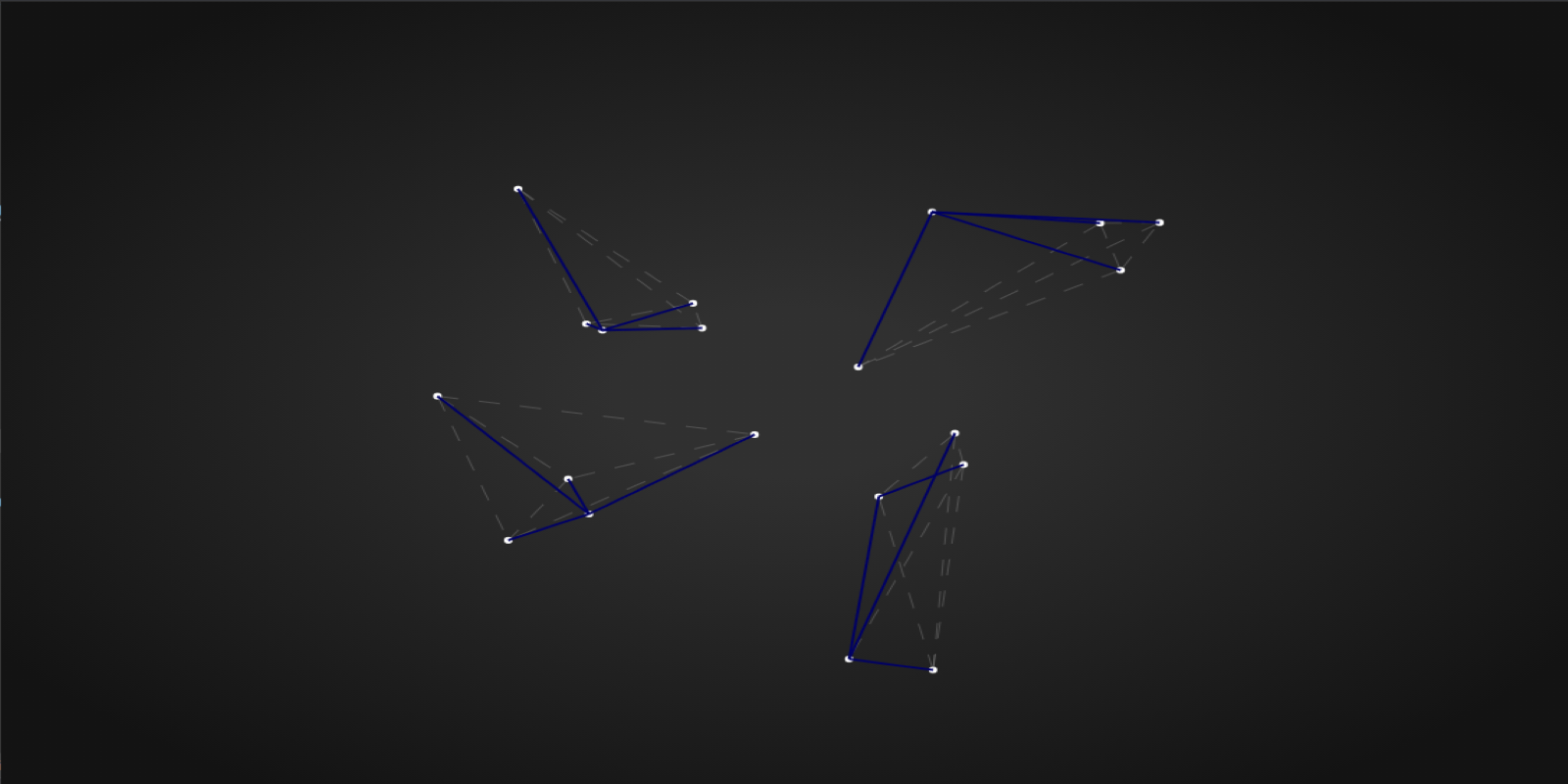
I wanted to have a different particle animation for mobile sites, so I thought instead of a shortest path algorithm I would apply a minimum spanning tree, so what I do is create edges between different points and then find the weight of the edges based on distance, as Kruskal’s algorithm only works with positive weights we don’t examine direction. After calculating the weights of the existing edges, we run Heapsort on the array of edges sorting them by their weight efficiently and then we apply MST Kruskal to the sorted edge array. I was successfully able to visualize the MST and it would update each frame but it was not as dynamic as the SP algorithm, one tree would always be optimal in most frames. To try to remedy this I added a edge randomization algorithm that would dynamically recreate edges between points randomly every 100 animation frames, there is now a noticeable change in tree instead of a quick flicker but it still isn’t aesthetically pleasing compared to the SP visualization, in addition because it requires sorting, Kruskal and an edge randomizer it’s not as mobile friendly, so I wont be using it on the site, but I still believe it is impressive on its own.
Personal Website

Software – HTML5, CSS, Bootstrap 4, JavaScript, Anime.js, fullpage.js, jQuery, JPopper, CSS Grids, GitHub, simplebar.js, Figma, TimelineMax.js, TweenMax.js
Knowledge – Responsive Web Design, GUI design, UX design, HTML5 Canvas animations using JavaScript, Algorithms, Regression Testing, Unit Testing, Debugging
When I started working on this site, I had a vague idea of what I wanted, after a lot of research, learning and revision what I made is a reflection of my passion towards my work. I started simple, creating a navigation menu, with a top bar for in site navigation and a bottom bar for social navigation with custom animations on hover to give an interactive feeling. On smaller screens these navigation bars are replaced by a burger bar icon which opens up to a transparent curtain menu. A small feature on the social menu is a popup modal which shows my email and number and when clicked copies the email directly into the user clipboard for ease of use.
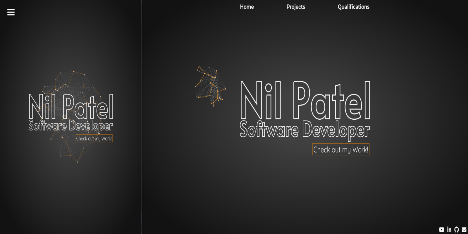
I then started working on the home page (or the index page). I wanted a simple page that would also show off some web design skills I had yet to learn. I learned how to use anime.js to animate SVG paths and then used Figma to design an SVG that would act as a logo for my site, I further added a little “call to action” in the same SVG to lead users to the page you are on currently. By including the “call to action” with the logo it size remains consistent in relation to the logo. To add a little something extra I decided to add a particle animation, which I discuss in the “Dijkstra’s Algorithm Visualization” and “Kruskal’s Algorithm Visualization”. To adapt the animations to my site for desktop users I have the particles follow the user’s mouse, disappearing when the mouse leaves the browser window and reappearing on reentry, all the particles remain around the mouse within a set radius. For the smaller windows (mobile display) I stop tracking mouse movement and have the particles move around the center of the screen within a radius.
The next page I worked on was the projects page. My goal was to make sure the page focused on my projects nothing extra. I wanted to easily be able to add new projects and keep a consistent format to achieve this I tried using bootstrap containers and looked at other options but I found the best way ended up being using CSS grids, I was able to design a responsive page that I can easily update in the future with more projects. I also utilized simplebar.js to make it so that you can scroll through longer project descriptions within grid cells and not have an eyesore scrollbar in each project description that’s longer than the given space. Of course, at the bottom of the page is a “call to action” leading users to a section about my qualifications. Be sure to click it after your done here!
Finally, the last page on my site is the qualifications page, I could have designed it similarly to my projects page but I wanted to instill a feeling of difference between the two pages so I used fullpage.js to add a snapping transition between full page sections that go through my education and other qualifications. In mobile and smaller screens, I turn of the fullpage.js transitions and switch to a grid display similar to the projects page. Within one of the sections I have a slideshow which will automatically switch certificates over time and in desktop sizes has controls that are revealed when hovered over all written using custom JavaScript.
After shipping the site I found that the particles would not display on IOS devices but were fine on Windows, MacOS and Android; I ended up extensively debugging the animation on IOS devices by using an isolated copy to update live to GitHub Pages and check the result on my iPhone regression testing from a completely new JavaScript file until I isolated a bug in which IOS would not load the canvas animation when the JS for the particles was within a conditional statement even if the condition statement were true (“if(true)”). I then redesigned my code to have a single class and method for mobile and desktop instead of a separate class and methods in a conditional statement. I added the conditional statements in each class and method that checked a switch variable that would be updated when resizing between mobile and desktop screen sizes or initially opening the page.
As you can see this website was designed with a lot of thought and effort, I hope you enjoyed your time here, thank you very much for looking at my work.
Scratch Game
Software – Scratch
Knowledge – Algebra, GUI Design, Game Design
I created this game for an assignment for Harvard’s CS50x EdX course. I shared it with some friends and through there feedback improved it to where it stands currently. The main challenge I had was implementing features with Scratch’s limited syntax and functionality. The game is fairly simple, the player is flying a cargo ship that was sucked into a wormhole which dropped it in the middle of a meteor field. The ship lacks any offensive capability, you must rely purely on your flying skills and luck to make it out alive. The game consists of 10 waves of meteors (levels) with 170 meteors total, each level either introduces a unique meteor travel logic or increases the difficulty. The are meteors that travel diagonally down, diagonally up, horizontally across the screen and those that spawn and fly through the position the ship was in when the meteor spawns. This game requires near perfect reflexes and some luck (the meteor paths and speeds have some randomness) to clear, but you can challenge yourself to beat your personal best with a count of the meteors you avoided and the level you made it to on the top right and a best record tracking the most meteors you dodged in your current sitting. You can click the green flag to play, controls are WASD or Arrow keys. Hope you have some fun!